Operating the Templates
Data Input: Basics and Navigation
Each Metrics Framework Guidebook Template workbook contains multiple tabs or worksheets. You will notice the navigation tabs at the bottom left-hand corner of your screen. The exact names and number of tabs will vary between workbooks, but the yellow tabs allow for data entry and green tabs contain the graphical displays. Therefore, to begin using your workbook, you will want to start with data input on the yellow tabs.
To prevent any inadvertent erasing of formulas, all calculation cells are locked. In the data entry tab, you will enter values into the yellow cells. All other cells will calculate as necessary, so you only need to enter whole numbers.
Aside from the yellow boxes, the data entry tabs are set up with consistent visual cues across workbooks. First-time freshmen (first-time in college, FTIC) data entry areas will have green at the top, while transfer/prior-credit data entry areas will have orange at the top. Slightly darker shading tops denominator columns (total numbers of students in the cohort), while lighter shading tops numerator columns (numbers of students meeting a particular criterion). If the shading is difficult for you to see, each column is clearly labeled as “numerator” or “denominator” to help you understand how it will be used in a calculation.
Checking for Completeness in Your Data
At the top of each data entry table is an “overall” row. For the given cohort of data, enter the overall figures first. All of the templates are designed such that the values of a particular subgroup (e.g., all possible values of Gender) add up to the total you specify in the overall row for that column; otherwise, your graphics will be distorted.
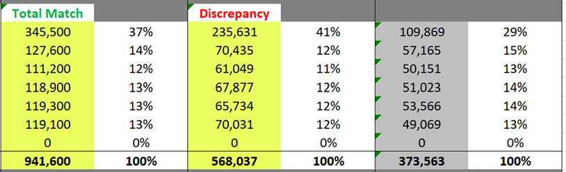
In the header row for each subgroup in a table, there is a “summation check” that will compare your overall value to the sum of the values you have provided for the subgroup. The left-hand side of Figure 6.1 provides an example of what your sheet will look like when your subgroup values total up to the overall value—you will see the words Total Match in green. This indicates that your data were entered correctly. Likewise, the right-hand side of Figure 6.1 shows what happens when your subgroup values do not total the overall value (in red). In this example, the subgroup total comes up short and is therefore negative, indicating a data input error.
Figure 6.1. Demonstrating the Total Match feature
All subgroups are equipped with an “unknown” option so that it is easier to properly categorize all of your students within each demographic. While it is encouraged for you to explicitly enter values of zero, a blank will be treated the same way.
Most data entry sheets also include a column displaying a percentage of total to the right of each yellow data entry column. The percentages calculate automatically using the overall value at the top of the column as a denominator. This feature is designed to provide a sense of data completeness and offer some instant metrics. If all students are categorized into values of a demographic subgroup, these percentages should total 100 percent.
Using the Graph Filters
Once data has been entered in the yellow data entry tabs, the graphs in the green graphical display tabs will automatically populate. In the interest of creating the most compelling displays, three comparisons are always present: full-time versus part-time, first-year credit accumulation level, and gateway course completion. Two more levels of specification—student classification and demographic—are controlled by drop-down menus. When you change the selection in the drop-down menus, the graphical displays will follow suit.
Access, Progression, and Completion
- Classification: Available choices are (a) All Entering Cohort, (b) First-Time/Freshmen (FTIC), and (c) Transfers/Prior Credit. In the Data Entry tab(s), you will separately enter values for FTIC and Transfer. All Entering Cohort values are calculated by adding the FTIC and Transfer values together, so there is no need to enter this total manually.
- Demographic: Available choices are (a) Race, (b) Gender, (c) Age, (d) Readiness, and (e) Pell. If you select any demographic other than Race (see below), the graphs will fill with all available data. The graphs are designed to simultaneously show the results of up to four subgroup values within a demographic; in these cases, there is always an “All Students” category up top, followed by the specific breakouts.
- Race Groups: If you select Race in the Demographic drop-down, you must select which specific racial/ethnic groups you want to see in your graphs. This is achieved by using the drop-downs in the Race Group selectors. The visualized values will appear in the same top-to-bottom order in which the drop-downs appear.
Pipeline
The drop-down selectors in Pipeline for classification and demographic work similarly to those of the Access, Progression, and Completion workbooks, but because the graphs are set up to show only one subgroup at a time, there is a drop-down box labeled Sub-Selection.
The Sub-Selection drop-down is dynamically linked to the value shown in the Demographic selector box. Once you select your demographic category, click on the Sub-Selection box to choose one of the options. Please note that changing the Demographic value will not immediately yield a change in Sub-Selection; you must click on the Sub-Selection box to then change the value and subsequently the graph.
Cost
The Cost template is comparatively simplistic, due to the nature of the data being displayed. The only selector available is for viewing data either by Pell status, unmet need quintile, or race.
Print-Friendliness
All green (graph) tabs are set up so that you can print the graphics on standard 8.5” x 11” paper in a properly arranged fashion. The selected filters will show up at the top of each page as well as the title.
Specific Template Considerations
Access
Overview
The Access template breaks down the milestones of potential and actual students into three stages: (1) admission, (2) enrollment, and (3) first-year credit accumulation. Likewise, the data entry sheets follow suit with these stages.
Some data elements, such as college readiness or Pell status, are only available once a student enrolls at an institution. Therefore, the Admitted Students table only contains race, gender, and age information, for students seeking admission as either first-time-in-college or transfer (another demographic that can be gathered at the admission stage). Once a student reaches enrollment status, college readiness and Pell metrics can be gathered, as well as full-time and part-time status.
Pipeline
This graph allows you to gain a sense of how students of different subgroups compare in the first part of their educational pipeline: out of all students who are admitted, what percentage do not enroll and what percentages do enroll at different credit-taking intensities (full-time and part-time) and meet different credit-earning thresholds in the first year. For this graph, “meeting credits” is represented by earning at least 24 credits in the first year as a full-time student or at least 12 credits in the first year as a part-time student. The graph is arranged so that the darker colors (meeting credits) are at left, followed by lighter colors (not meeting credits), and finally the not enrolled group.
Only race, gender, and age are available options, as no admissions data are available for the other disaggregates.
Loss
This two-graph set breaks the pipeline graph into two parts to help determine where in the initial education pipeline students may be disappearing. In the admissions-to-enrollment graph, the focus is on enrollment versus non-enrollment, with a breakdown for full-time and part-time. The denominator is the number of students admitted. In the second graph, enrollment-to-credits, the number of students enrolled serves as the denominator, with a focus placed upon credit-earning momentum in the first year once enrolled.
All demographic options are available, but the Phase 1 (admissions-to-enrollment) will be blank if either readiness or Pell status is selected.
Diversity
The focus on this tabular output is tracking the changes in diversity at each phase of enrollment. Percentages accompanying counts are for the column; for example, the percentage of Black students out of students of all race categories. The change percentages, accented by arrows, show the change in that subgroup’s share as compared to the previous phase. This table is a quick way to determine if a percentage share of a particular subgroup changes notably between admission and enrollment, as well as between enrollment and the categorization of meeting adequate credits in the first year.
Progression
Overview
The Progression template examines retention for both the short-term (first-year) as well as the longer term (years 2 through 5). You will notice two yellow data entry tabs. The first, labeled for Year 1, has three sets of tables (FTIC and Transfer) for three different categorizations of students as of the end of their first year: (a) credit accumulation after the first year, (b) whether or not the student completed Gateway English as of the first year, and (c) whether or not the student completed Gateway Math as of the first year. We suggest you pay close attention to the table headers to ensure you’re entering full-time and part-time students in the right locations.
The second data entry tab asks you to consider the same cohort of students and enter their outcomes as of two, three, four, and five years after entering your institution. In the interest of space, no percentages are calculated alongside these figures, but the “Total Match” error-checking mechanism is still present. Also, please note that full-time and part-time are separated into consecutive tables, as well as the fact that you do not need to re-enter your denominators—this is why those cells are colored with a gray background.
For most of the data being entered, you should consider a combined outcome of being retained or graduating. However, in the all-encompassing pipeline analysis (found in the separate Pipeline workbook), you will likely want to break out what percentage of those students retained in Years 4 and 5 are still enrolled versus those who graduated. Therefore, the Years 2-5 Data Entry sheet provides a specific set of columns for enrollees graduating (and only graduating) after four or five years. These data will be copied over for the Pipeline workbook but not used anywhere in the Progression workbook.
Credit Accumulation
This set of graphs (one for full-time students, one for part-time students) helps to give a quick visual of what percentage of enrolled students were retained after the first year. Each subgroup value is clustered together, with each of three bars representing high, moderate, or low numbers of credits earned in the first year.
Gateway Courses
The graphics on this tab function identically to those on the Credit Accumulation tab but reflect retention as broken down by gateway English course completion (top two graphs) and gateway Math course completion (bottom two graphs), respectively.
Longitudinal Retention
Using all of the data entered, this panel of line graphs shows five-year trends for each subgroup. Each small graph within a panel represents one subgroup (e.g., Black or female or receiving Pell grants), with each line within the graph representing either a credit-earning category or a gateway course completion category.
Completion
Overview
The Completion template is designed to display 6-year graduation information for the same cohorts for which you have provided data in the other tabs. The data entry tab should take a similar form as that of the Year 1 progression data entry tab; there are three sets of tables (FTIC and Transfer) for three different categorizations of students as of the end of their first year: (a) credit accumulation after the first year, (b) whether or not the student completed Gateway English as of the first year, and (c) whether or not the student completed Gateway Math as of the first year. We suggest you pay close attention to the table headers to ensure you’re entering full-time and part-time students in the right locations.
Credit Accumulation
This set of graphs (one for full-time students, one for part-time students) helps give a quick visual of what percentage of enrolled students graduated after six years from start. Each subgroup value is clustered together, with each of three bars representing high, moderate, or low numbers of credits earned in the first year.
Gateway Courses
The graphics on this tab function identically to those on the Credit Accumulation tab but reflect six-year graduation as broken down by gateway English course completion (top two graphs) and gateway Math course completion (bottom two graphs), respectively.
Cost
The Cost template is designed to display six-year graduation information by cost category. We understand that these variables are often hard to obtain, so the options are not as diverse as in the other templates. Disaggregation options include the quintile in which a student’s unmet needs fall (unmet need quintile) and Pell recipient status. The Cost tab contains the graph that shows the distribution of whether students completed a credential within six years; the switchable category selection will change the graphical display.
Pipeline
Overview
The Pipeline visualization is designed to provide a complete, birds-eye overview of Access, Progression, and Completion. In the interest of not having you re-enter data, there is no data entry tab in this workbook. Rather, a separate file (Metrics Framework Guidebook – Pipeline Data Copy Macro) provides you with a single-click solution to load the Pipeline workbook with whatever data you have entered in the other three workbooks. Specific instructions for operating this macro are located within the macro file itself.
Graphs
The first, large graph in the Pipeline workbook displays the entire cohort from admission to six years out from enrollment. A few things to keep in mind:
- Admitted will always show 100 percent at the top.
- Enrolled percentages and bars are out of the Admitted n-size (located in the graph’s title).
- For Years 1 through 6, the size of the bars uses the denominator of admitted students, but the percentages in the labels use the denominator of that specific group’s enrolled students. For example, if you had 2,000 admitted students and of those, 500 students who enrolled full-time and were in the high credit-earning group, and 400 of those students returned, the label would read 80 percent (400 returning students out of 500 students in the enrolled, full-time, high-credit group) but the length of the bar would represent 20 percent (400 students out of 2,000 total admitted students). The purpose of this is to demonstrate the overarching pipeline of the entire process, so the never-enrolled students are still present throughout.
- Starting in Year 4, the colored retained bars are split into graduated (textured, patterned) and still enrolled (solid). If you did not enter any data into the “graduated only” area of the Progression tab, however, all students are grouped into the solid, retained category.
All of the outcomes in the large graph up top are presented in tabular format below the graph. This may be helpful if you have very small group sizes that would otherwise be lost.
A smaller graph to the right of the table outlines only the progression-completion portion of the pipeline. In this case, the size of the bars uses the denominator of all enrolled students (with the n-size up top in the graph’s title), but the percentages in the labels, as with the large graph at the top, use the denominator of that specific group’s enrolled students.
General Data Guidance
To ensure that you are making the most of your data templates while protecting student privacy and confidentiality, we recommend you keep the following concepts in mind.
- Follow all state and federal laws related to data privacy and security. For a guide to federal privacy law, review this resource: Protecting Privacy and Information Security in a Federal Postsecondary Student Data System. We also recommend that institutions develop or attend staff trainings on data privacy, security, and confidentiality.
- Create a data team! As you build inter-/intra-office collaborations, bring interested parties together on a regular basis to interpret results and develop metrics collaboratively.
- You may not have data for all the fillable boxes, and that is okay. For example, college readiness is not necessarily a measure that is collected for transfer students. The boxes for entry are available in case your institution does collect that information.
- Before filling out all of the templates, think ahead to the data you have available. When all of the templates are brought together (aside from Cost), they form one pipeline of students. Pick a cohort and fill in the information with consistent figures (i.e., the denominators of students) across all of the workbooks for the best results.
- Pay attention to your sample sizes when thinking of the most compelling graphical choices. For example, at an institution of 5,000 students, narrowing in on a subgroup of 8 students is not necessarily useful. Minimum group sizes should be 10 and, more preferably, 25. Further, though these templates only require input of aggregate data, small sample sizes can also allow for re-identification. Data should be maintained on a secure server, not transmitted through email, and small sample sizes should be avoided due to their capacity to produce highly variable results. Instead, aggregate small sample sizes into rolling cohorts as needed.
- The templates are designed to show specific figures and primarily to help you see the larger picture of potential gaps in student performance at your institution. The graphs are designed to show striking contrast when differences are present.
- Use data wisely—for good and not for evil. Data can illuminate positive and negative patterns. As an institution, you should be striving towards better results, but those results need to come from better institutional practices targeted at removing hurdles in the way of student success. In general, students are doing the best they can with what they have, so use data to remove those hurdles, instead of blaming students for unsuccessful outcomes.
- Never stop looking! When results are compelling, dig deeper with new analyses. Supplement data with qualitative research by talking to students and conducting focus groups. The key to addressing barriers to success is knowing exactly what they are, and students can tell you exactly where to start (or continue) searching.